Tutor Barry Spencer experiments with letter design
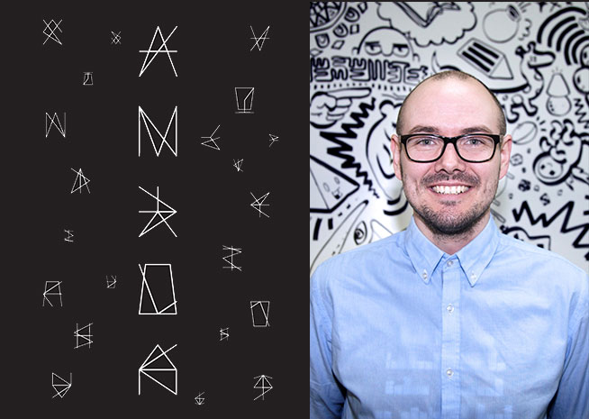
Barry Spencer is an Australian type designer who creates letters using mind-bending geometric art and animation. He is a tutor in Graphic Design and Core Studies at the Academy of Design Australia, and has recently released his first book, Speculatype, which is on sale now.
When did you discover your passion for typography?
I only touched on typography as part of other projects when I was at uni, and it wasn’t until I graduated that I fully got into it. I didn’t start out trying to question everything, I just wanted to make nice, clean, good, proper typefaces and maybe sell them. Early on, I did a bunch of workshops called ‘Everything in Between’, run by a studio called 3Deep Design, where a new professional would come in every week and you had to answer a brief in three hours without technology. As part of this, I enjoyed the play with type and grids and so I started reading as many books on type as I could to try and figure out what it was and how I should do it. Slowly, as I was learning, I was making type and experimenting and it led to a bunch of other things and ideas, but at that point it was more about knowing the rules and less about breaking them.
You describe yourself as a ‘legibilitator and speculator’. What does that mean?
Legibilitator is a made up word to have a bit of fun and Speculator is because I speculate on things. Most of the time I call myself a ‘speculative type designer’ – that means that I will try and push and pull and see what I can do and explore with type, without necessarily worrying about what the answer is. I’ll take it to its far extremes even if I think it’s wrong or not going to lead anywhere, because it’s better to try it and see if it works, then not attempt it because I think it’s going to be wrong.
Is that a message that you give to your students - about risk taking and failure as part of the creative process?
Yeah, we’re doing it right now. It’s part of the stage I’m working on with my Graphic and Digital Design 4 students. Part of this stage is experimenting, and I’m trying to get them to run out of ideas, so that they have to ‘grasp at straws’ and follow an idea they might think is silly or “wrong”. It’s about getting the students out of their comfort zone. We are not thinking about what we should be doing, but what we could be doing. I try to challenge expectations. We expect to see something in a certain way and that’s the easy way to go about it, and that might work a lot of the time, but it’s when we challenge ourselves that we come up with something more interesting or innovative, or useful to us.
Why do you use animation in your typography work? Is this unusual in your field?
No. It’s not unusual to animate type, but I’m animating my unusual type. Basically, I got sick of not knowing how to use Adobe After Effects, so I challenged myself to do it, and that all came about because I was taking part in 36 Days of Type. It’s a worldwide challenge where every day for 36 days you create a new letter of the alphabet in order, so A-Z and 0-9. I tried After Effects for the ‘B’ and kind of liked it, and the next day I used it to do the ‘C’. After that I decided to link it to another project of mine from 2015, called 100 Days of Spontaneous, where I challenged myself to make a new grid structure every day for 100 consecutive days. So in the end, from that point, every single day as part of 36 Days, I used a grid that I’d never used before, made a new letter from scratch, then figured out how to animate it in After Effects. It was great fun, but exhausting.
Congratulations on just releasing your first book!
Thank you! I’m hoping it’s just the first, I’d love to release more.
Your book is your PhD. How did you make your PhD accessible to the public?
I wrote it as if I wanted to read it. I tried to make it a visual thesis that is easy to digest. I break up the book with in-depth case studies about key typefaces I made that changed my understanding of type and break it all down into where I started, to when I started to change my perception, to when I gave myself permission to speculate.
So it’s not just about typefaces, it’s about your journey and your approach to typeface and letterform design?
Yeah, there’s a methodology in there that people could adapt and apply to other things. It could apply to fashion or to photography, or lots of disciplines – it’s about allowing yourself permission to not do what’s expected.
What are your influences?
I get inspired by patterns, people, objects, architecture and generally being aware of my surroundings, looking up, looking down, etc. Some of my typefaces are based on the floors of train-stations, others on window treatments, or roofs, or utility markings on the ground. Others are inspired by friends, techniques, challenges or even history.
What three tips would you give to aspiring type designers or typographers?
Read up and learn; try it out by practicing and making; and engage. Find people who like the same thing, and be ok with putting your work out in the world.
Barry Spencer has been featured on Subtle Disrupters and Vice. He has presented at the Australian Typism Conference and works as a tutor in Graphic Design and Core Studies at the Academy of Design Australia. In 2016, Barry created the first public installation for the Academy foyer’s new ‘Pegboard Wall’ - a typographic artwork with overlapping letterforms pronouncing: “CHALLENGE WHAT IS EXPECTED.”
Same theme

In the spirit of reconciliation LCI Melbourne acknowledges the Traditional Custodians of country throughout Australia and their connections to land, sea and community.
LCI Melbourne pay respects to the Wurundjeri Woi Wurrung people and acknowledges them as the Traditional Owners of the land on which our campus is situated. We recognise this as a place of special significance for the Indigenous community.
We pay our respect to Elders past and present and future. Indigenous sovereignty has never been ceded.